How to Generate Images with Japanese, Korean, and Chinese Text Using gpt-image-2
Can AI generate Japanese text in images? Yes — if you know the tricks. Practical guide to rendering kana, kanji, Korean, and Chinese cleanly with gpt-image-2 and Nano Banana 2.
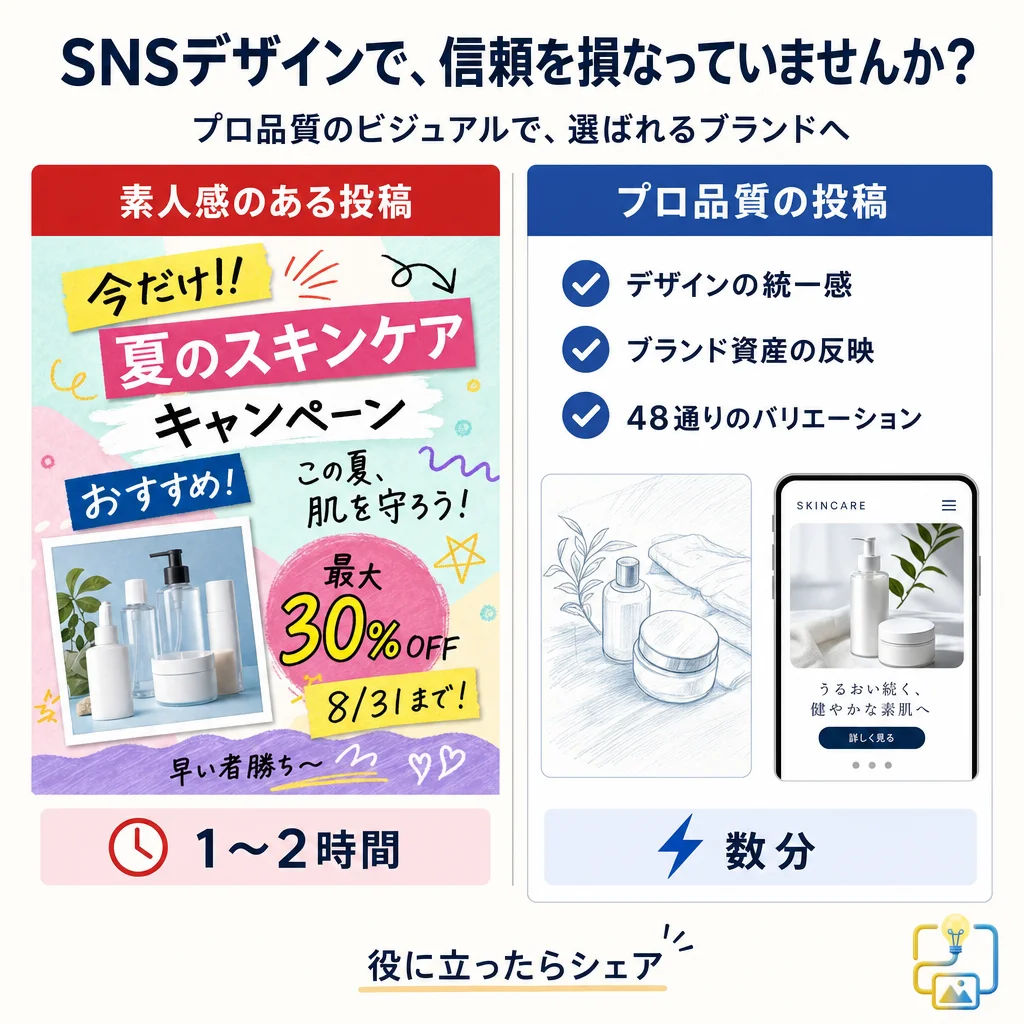
Most AI image generators still treat CJK text — Japanese, Korean, Chinese — as a second-class citizen. They'll render an English "SALE" badge without a problem, then produce "セ一ル" with a rogue long-vowel mark or garbled kanji radicals that only a native reader will notice but every native reader will notice. For a brand trying to use AI visuals in Japanese, Korean, or Chinese markets, that's not a minor cosmetic issue — it's a trust failure.
This guide is how to actually generate images with CJK text using gpt-image-2 (OpenAI's 2026 image model behind ChatGPT Images 2.0) and Google's Nano Banana 2 (`gemini-3.1-flash-image`). Which model handles which script best in 2026, the prompt patterns that work, the checks you must run before shipping, and when to stop asking AI to render type and move it into post-production instead.
Can AI Generate Japanese Text in Images?
Short answer: Yes, but with caveats.
- gpt-image-2 can render short Japanese, Korean, and Chinese text — typically 1 to 6 characters — with meaningful accuracy as of April 2026. Character-level rendering has improved significantly over DALL·E 3, but character-accuracy drops as length and font complexity increase. Kanji with dense stroke counts still fail fairly often, and increasingly so as length and complexity rise.
- Nano Banana 2 (Google's `gemini-3.1-flash-image`) currently handles CJK text more reliably than gpt-image-2 for text rendered inside the image, especially for longer strings, vertical Japanese layout, and multi-line captions. This is partly because Google's training data includes broader multilingual visual content.
- Neither model is reliable enough to ship type without visual verification every single time. The failure rate is low enough to tempt you into skipping checks; it is not low enough to actually skip them.
Quick checklist before shipping AI-generated CJK text
- [ ] Read every character out loud in the source language (or have a native speaker do it)
- [ ] Check kanji stroke order and radicals — the model will invent plausible-looking but incorrect kanji
- [ ] Verify long-vowel marks (ー vs 一), small kana (ゃゅょっ), and dakuten/handakuten (゛゜) have not been substituted
- [ ] Confirm no characters have been invented that don't exist in the script
- [ ] For vertical layout: confirm punctuation and small kana have flipped correctly
- [ ] For 6+ character strings: strongly consider generating the image text-free and typesetting in Figma or Canva after
What Passing Output Actually Looks Like
Theory aside, here is what shipping-quality CJK rendering looks like. These are real outputs from Adpicto's image generation (which routes in-image text requests between gpt-image-2 and Nano Banana 2), used as style previews inside the product. Each survived multiple generations plus the same native-reader verification described in the checklist above — this is curated output, not average first-try quality.

Note how the failure points this guide covers — long-vowel marks, small kana, kanji radicals — hold up at headline size. Smaller UI-size text fails more often as point size drops.
The handwriting-style copy in that infographic is the exact case we flag below as the most failure-prone; it shipped only because it was regenerated and verified. There is still no way to make brush or handwriting CJK reliable on the first try in 2026.
Put differently: shipping this much CJK text without verification is still reckless in 2026. Build the workflow around generate → native-reader check → regenerate. For the prompt construction itself, our gpt-image-2 text and layout prompt recipes collect the working templates.
Why CJK Text Is Harder for AI Image Models
English text uses a 26-letter alphabet with relatively simple glyphs. Japanese uses three writing systems simultaneously — hiragana, katakana, and kanji — with kanji alone running to 2,000+ common characters. Korean uses hangul, which is phonetic but assembled into syllabic blocks of 2–4 components per character. Chinese uses thousands of characters with fine stroke distinctions that change meaning entirely.
For an AI image model, this translates to three compounding problems:
- Training data asymmetry. The public internet has vastly more English visual+text content than CJK. The models see "SALE" millions of times and ひらがな + 漢字 combinations thousands, not millions. More exposure = more accurate rendering.
- Stroke-level precision matters. In English, "0" vs "O" is similar and usually recoverable from context. In kanji, "大" (big) vs "太" (thick) differ by a single dot — and the meaning is not recoverable from context when the dot is wrong.
- Mixed-script layout is standard. A single Japanese caption often contains kana, kanji, alphanumerics, and English loanwords simultaneously, with kerning and vertical alignment expectations that differ from Latin type. The model has to coordinate multiple scripts in the same output, which is harder than rendering one well.
gpt-image-2 vs Nano Banana 2 for CJK Text: An Honest Comparison
How the two models compare for embedded CJK text, script by script — gpt-image-2 is the weaker of the two here, and Nano Banana 2 is the more reliable default:
| Scenario | gpt-image-2 | Nano Banana 2 |
|---|---|---|
| Short Japanese badge (1–3 kana) | Good | Very good |
| Japanese business phrase (4–8 chars, mixed kana + kanji) | Fair | Good |
| Japanese sentence in image (10+ chars) | Poor | Fair |
| Vertical Japanese layout | Fair (inconsistent alignment) | Good (handles vertical layout more reliably) |
| Korean hangul short text (1–5 chars) | Good | Very good |
| Korean sentence (10+ chars) | Fair | Good |
| Chinese (Simplified) short text | Good | Very good |
| Chinese (Traditional) short text | Fair (some simplified/traditional confusion) | Good |
| Dense kanji (stroke count 15+) | Fair | Good |
| Handwritten CJK style | Poor | Fair |
The practical takeaway for 2026: if your image needs readable CJK text embedded and you can pick one model, Nano Banana 2 is the more reliable default. gpt-image-2 is fine for short logos, badges, and 1–3 character accents — and its other strengths (reference fidelity, Pro-tier quality) often make it worth using anyway, with post-production typesetting instead of embedded text.
This is exactly why tools like Adpicto route between both models: on-image text requests get Nano Banana 2 by default, premium Pro-mode requests get gpt-image-2, and the user doesn't have to decide.
Prompt Pattern 1: Short Japanese Badge (Safe Zone)
The safest place to ask AI to render Japanese is a single-word badge with 1–4 characters, in a clean sans-serif style, on a solid background.
Template:
A minimal circular badge on a {background color} background, soft top-left studio light, the single word "{Japanese word}" in clean modern Japanese sans-serif type centered inside the badge, {brand accent color} as a thin border, 1:1 aspect ratio. High contrast, legible typography.
Filled example for a "NEW" badge in Japanese ("新作"):
A minimal circular embossed badge on a warm cream background, soft top-left studio light, the word "新作" in clean modern Japanese sans-serif type centered inside the badge, terracotta as a thin border, 1:1 aspect ratio. High contrast, legible typography.
Verification: "新作" (shinsaku = new product) uses two kanji that each have a standard stroke order. Before shipping, check that both kanji render with the correct components. "新" has the radical 斤 on the right; "作" has 亻 on the left. Missing or altered radicals are the most common failure mode.
Prompt Pattern 2: Hangul Short Text (1–5 Characters)
Korean hangul tends to render slightly more reliably than kanji in both models because the syllabic blocks have more structural regularity. Still, short is safer than long.
Template:
A clean graphic poster with the Korean word "{hangul word}" in bold modern sans-serif type, centered composition, {bold color block} background, {accent color} underline beneath the text, high contrast, 4:5 aspect ratio. Legible typography, no additional text.
Filled example for a "SALE" variant in Korean ("세일"):
A clean graphic poster with the Korean word "세일" in bold modern sans-serif type, centered composition, bold deep-red color block background, white underline beneath the text, high contrast, 4:5 aspect ratio. Legible typography, no additional text.
Verification: "세일" should have exactly two syllabic blocks, each cleanly formed. Common failures: the ㅇ circle becomes an oval, the ㅣ stroke becomes too angled, or a non-existent jamo (consonant/vowel) appears.
Prompt Pattern 3: Chinese Short Phrase (Simplified)
Chinese text rendering is where the two models diverge most. Nano Banana 2 handles Simplified Chinese noticeably better; gpt-image-2 sometimes mixes Simplified and Traditional glyphs within the same string.
Template:
A minimal product poster with the Chinese phrase "{simplified Chinese phrase}" in clean modern sans-serif type, centered horizontally, {background description}, soft natural light, {aspect ratio}. Legible typography, no additional text.
Filled example for "限时促销" (limited-time promotion):
A minimal product poster with the Chinese phrase "限时促销" in clean modern sans-serif type, centered horizontally, warm cream background with a single product silhouette below the text, soft natural light, 4:5 aspect ratio. Legible typography, no additional text.
Verification: Check each of the four characters against a reference. "限" has the radical 阝on the left; "时" has 日 on the left; "促" has 亻 on the left; "销" has 钅 on the left. Native readers spot missing or altered radicals instantly.
Prompt Pattern 4: Vertical Japanese Layout (Editorial Style)
Vertical Japanese layout is a specific aesthetic — editorial magazines, product packaging, traditional branding. Both models can handle it, but they differ in reliability.
Template:
A minimal editorial photograph with vertical Japanese text "{Japanese phrase}" running top-to-bottom on the right edge of the frame, {subject centered in the frame}, {lighting and style specification}, muted {palette}, {aspect ratio}. The vertical text should use proper Japanese vertical punctuation and small kana orientation.
Filled example for a sake brand's seasonal label:
A minimal editorial photograph with vertical Japanese text "冬の限定酒" running top-to-bottom on the right edge of the frame, a single ceramic sake cup centered in the frame, soft natural window light from the left, muted deep-indigo and warm-cream palette, 4:5 aspect ratio. The vertical text should use proper Japanese vertical punctuation and small kana orientation.
Verification: In vertical Japanese, small kana (ゃゅょっ) appear at the upper-right of their line, not the center. Long-vowel marks (ー) rotate 90° to become vertical lines. Punctuation marks like 「」 flip to ﹁﹂ for vertical. AI models fail at these details disproportionately often — a native reader will catch the orientation issue in under a second.
When vertical Japanese matters and the AI isn't reliable: generate the image with the background clean, then set the vertical text in a proper Japanese design tool (Figma with a Japanese font plugin, Adobe Illustrator with Japanese composer enabled, or Canva's vertical text feature).
Prompt Pattern 5: Safer Approach — Generate Image Clean, Typeset Text After
For anything longer than 6 characters, or anything where accuracy is critical (trademarked brand names, proper nouns, legal copy, product names), stop asking the AI to render the text. Generate the image with an empty text-overlay zone and typeset real type on top.
Template:
{your image description}, generous empty negative space at {specific location} for overlay text, {aspect ratio}. No text, no typography, no characters anywhere in the image.
Filled example for a restaurant Instagram post with a Japanese menu announcement:
A ceramic bowl of ramen with visible steam on a warm oak wood table, top-down three-quarter angle, soft natural window light from the left, shallow depth of field, muted warm amber and cream color palette, 4:5 aspect ratio. Generous empty negative space in the upper third for overlay text. No text, no typography, no characters anywhere in the image.
Then typeset "冬季限定ラーメン" in your brand's Japanese font in Canva, Figma, or Illustrator. Benefits:
- Zero chance of character errors
- You can use your actual brand type (AI can't match a specific foundry's typeface)
- Kerning, line height, and vertical alignment are under your control
- Legal-critical text (trademark marks, regulatory copy) is verified human-typeset
When to Use Embedded AI Text Anyway
Despite the reliability concerns, there are legitimate cases to let the AI render CJK text in the image:
- Stylistic, not literal. If the text is decorative and the exact characters don't matter ("vaguely Japanese-looking kanji as a stylistic element in a broader graphic"), accuracy concerns don't apply — though you should verify the characters don't accidentally spell something inappropriate.
- Short badges and stamps. 1–4 character badges on clean backgrounds are in the model's wheelhouse. Verification is fast; output is usable.
- Prototyping and concepting. For internal mood boards, competitive analysis, or quick concept tests, AI-rendered CJK text is fine. Just don't ship it as-is.
- Logo-adjacent explorations. When you're designing a logo or mark and want to explore how a Japanese word might sit in the composition, AI text gives you a starting point you then hand off to a real designer.
Common CJK Rendering Mistakes
Asking for too long a string. 6+ characters in a single line is where reliability drops sharply. Break it into shorter segments or move to post-production.
Not specifying the script explicitly. "Japanese text" can render in Chinese hanzi (kanji without kana) if the model is uncertain. Specify "Japanese text using hiragana and kanji" or "Korean text in hangul" to remove ambiguity.
Trusting the first output. AI-rendered CJK fails in ways a native speaker catches immediately. Always verify with a native reader before shipping to a CJK-market audience.
Asking for handwritten or brush-style CJK. Calligraphic Japanese and Chinese (書道 / 书法) is dramatically harder than print-style and fails more often. Use only for mood; never for literal content.
Forgetting small kana and punctuation. ゃゅょっ are smaller than their full-size counterparts (ヤユヨツ) and change meaning. 「」 is Japanese quotes, not 〝〟 or generic ""s. AI models interchange these.
Using models with older training data. Pre-2026 text rendering in image models was dramatically worse. If a guide was written for Midjourney v5 or DALL·E 2, treat the advice as historical.
Example: Shipping an Instagram Post for a Japanese Brand
A Tokyo-based cafe wants a seasonal drink announcement in Japanese. The workflow:
- Write the Japanese caption first. "秋限定・ほうじ茶ラテ" (autumn limited, hojicha latte). 10 characters including the punctuation.
- Decide text strategy. 10 characters is past the safe zone for embedded AI rendering. Plan to typeset after.
- Generate the image. Use gpt-image-2 with a prompt like:
- Typeset "秋限定・ほうじ茶ラテ" in Figma using a Japanese font (Noto Sans JP works well for digital) in the reserved negative space.
- Verify: native-speaker read-through confirms correct characters, no substitutions, appropriate kerning.
- Ship.
For the broader prompt-engineering context, see our 10 AI image prompt patterns for social media. For how this fits into a full Instagram workflow, the pattern is: clean image from AI, real type from a designer, ship.
What's Coming Next
CJK rendering will keep improving — both OpenAI and Google are training newer models with more multilingual visual data. By late 2026, expect 10+ character reliability to approach current short-text levels. Until then, the honest advice is: use AI for imagery, use human-typeset type for words, and verify everything CJK before you publish.
Shipping to Japanese, Korean, or Chinese audiences and tired of fighting character errors? Start with Adpicto free — no credit card required, 5 AI-generated images per month on the free plan, with automatic routing to whichever model handles your script best.
Ship CJK-Accurate Imagery Without the Trust Risk
Brands lose trust in CJK markets fast when AI text errors slip through. The path to shipping safely:
- Short embedded text (1–4 chars): gpt-image-2 or Nano Banana 2 both work, verify with a native reader.
- Medium text (5–8 chars): prefer Nano Banana 2, still verify every character.
- Long text (9+ chars), vertical layout, or brand-critical copy: generate the image clean, typeset in Canva/Figma/Illustrator with a proper CJK font.
- Always: native-speaker review before publishing.
Related Articles
gpt-image-2 for Instagram Post Images: One Anchor Image, Every Format
Turn one gpt-image-2 reference image into every Instagram surface — 1:1 and 4:5 feed, 9:16 Stories/Reels cover, and a consistent carousel — via outpainting, reference anchoring, and mask edits.
gpt-image-2 for Restaurant Menu Images: Prompt Recipes for Announcements, Seasonal Cards, and Photo Fixes
How to use gpt-image-2 to turn a real phone photo of tonight's dish into a publish-ready menu graphic: announcement recipes, seasonal promo cards, and honest photo-enhancement mask edits.
gpt-image-2 Inpainting Guide: Masks, Prompts, and Fixes
Learn gpt-image-2 inpainting for social image edits: prepare masks, write masked-region prompts, run multi-pass fixes, and avoid seams or edge bleed.
Try this image workflow in Adpicto
Adpicto routes between gpt-image-2 and Nano Banana 2 automatically — generate and edit images straight from a prompt.
Create an image freeNo credit card required · 5 free images per month